THE MINIMALISTIC MUD ROOM
- Feb 26, 2020
- 3 min read
Our mud room was designed to offer convenient storage while minimizing clutter.

I'm a messy person by nature, I can't even deny it. I also experience mega anxiety at the mere sight of clutter which often results in my swiping handfuls of items off the counters and into junk drawers around the house. With these two competing personality quirks in mind, I debated heavily about whether or not we needed a mud room.
Kick Off Your Shoes
Literally! At every point in the design phase, I tried to really think about how we wanted to use the space. Everyone in our family kicks off our shoes as soon as we're through the door. This would happen with or without a mud space so having a designated place for our shoes did sound pretty nice. Our family also uses the garage door far more than the front or back doors so if we were going to have a mud room, placing it off the garage was a no brainer.
I thought about our routine, like the crazy train parade that occurs every. single. morning. as we rush out the door for school. I shuddered at the thought, and then realized that having a single place for all of our bags would be pretty convenient.

Next I thought about clutter. Ugh. Gross! But clutter is a part of life. When we were designing our kitchen, I literally tried to picture stacks on unopened mail on the island because it's inevitable.
The truth is, life isn't lived on an Instagram feed. No home is 100% camera ready, 100% of the time.
Imagining the house as we would really live in it meant acknowledging that in our home, a mud area would end up being a catchall for everything. This is something I wanted to avoid. I knew if I added multiple cubbies, I'd fill them. I also knew if we made it a massive space, we'd end up with endless piles of discarded coats and gloves. My answer to this was to minimize.
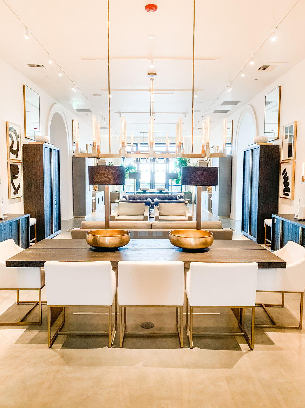
Minimal Design
We chose to have a bench with a single cubbie for shoes. I considered putting baskets in it to hide the shoes, but let's face it, I'm lazy. I'm especially lazy at 7:30 a.m. when I'm running out the door with two kids. I'm not stopping to dig for my shoes! I need to be able to see them. This is especially true for the 5 year old who couldn't see a shoe if it hit her in the face and landed on her foot!
We added 5 hooks at varying heights so each person has a hook including our pup, Howie. In actuality I didn't factor poor Howard into the equation, but he lucked out! I searched high and low for quality modern hooks for this area and fell in love with these from Restoration Hardware. Their knurled finish matches the light fixture in the adjacent powder room as well as the entryway. Bonus!

Finally, we chose to paint this area the same white as the walls, cabinets and trim to minimize attention. If we're being our authentic selves and leaving all sorts of clothing items on the mud area, we needn't draw any more attention to the space by going crazy with the colors!
What kind of space works best for your family's routine? Do you need a massive space for sports equipment or a small space hidden where guests can't see? Thinking about your own family's needs is crucial when designing a space you'll use every single day. Drop me a comment and let me know what space your family uses the most! Until next time.
All the Radness.
SHOP THIS POST


gamehitclub.it.com mình vào thử cho biết vì thấy bạn bè nhắc, kiểu lướt nhanh xem trang trông ra sao thôi. Cảm giác đầu tiên là bố cục chia khối rõ ràng, nhìn sáng và dễ theo dõi, kéo xuống là bắt được nội dung chính khá nhanh. Mình để ý phần giới thiệu có nhắc nền tảng ra mắt từ 2015, đọc như kiểu thông tin nền nên thấy cũng yên tâm hơn chút chứ không bị mơ hồ. Thanh menu đặt ngay chỗ dễ thấy, bấm qua lại không bị giật lag gì, chữ hiển thị vừa mắt nên không phải zoom hay căng mắt. Nói chung hợp kiểu người mới vào xem sơ qua, và mục lịch sử…
tỷ lệ kèo nhà cái mình thấy bạn bè nói suốt nên bữa rảnh mình ghé vào coi thử cho biết thôi. Mình không soi sâu nội dung, chủ yếu xem họ làm giao diện ra sao. Vừa vào là thấy trang nhìn sáng và dễ thở, chữ không bị dồn dập nên lướt khá thoải mái. Mình thích nhất là mấy khung dữ liệu họ trình bày theo cột, nhìn qua là biết đâu là con số chính, không phải đọc lan man. Với lại cái menu đặt khá rõ, chuyển qua lại giữa các phần không cần bấm nhiều bước nên đỡ mất thời gian. Nói chung cảm giác như họ ưu tiên cho người xem nhanh, kiểu…